Dalhia
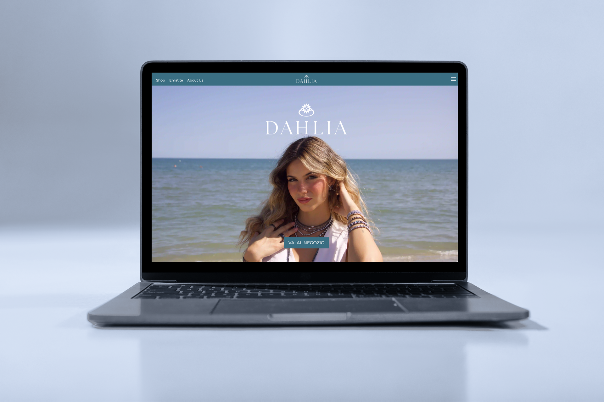
We designed the homepage with a full-screen hero section: a full-bleed editorial image with a model in the foreground immediately showcases the brand's products. The Dahlia logo is centred with its iconic symbol above, while a primary teal call-to-action — "Vai al negozio" — guides the user toward the catalogue. The result is an immediate, elegant visual entry point, fully consistent with the brand's identity.
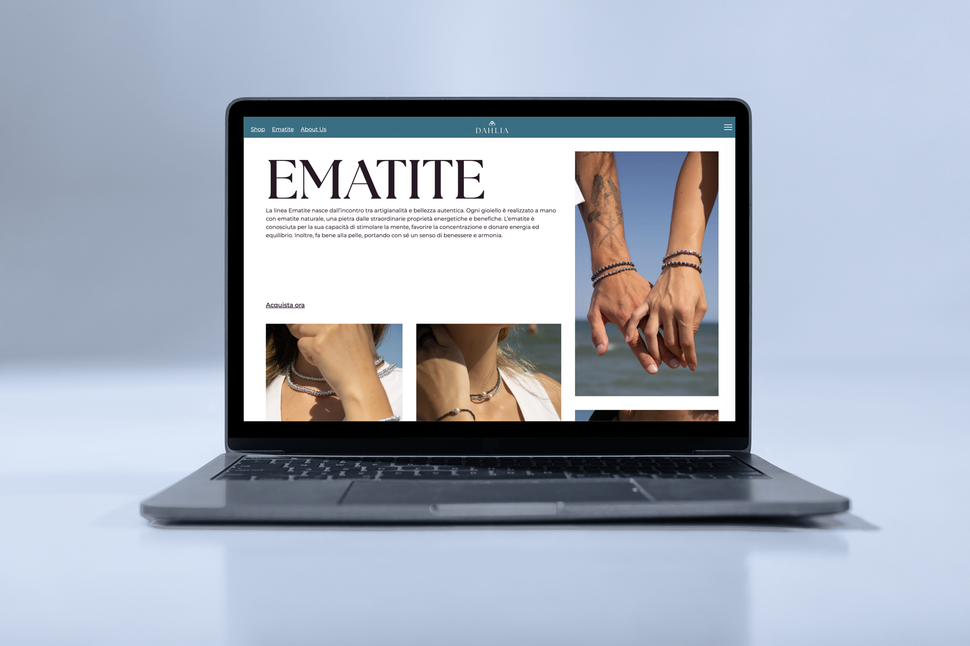
We designed a dedicated landing page for the Ematite product line: an editorial-style page featuring large-impact serif display typography, a mixed photo grid layout combining vertical and horizontal images, a product description section and a clear call-to-action. Fully integrated into the site navigation with a teal top bar consistent with the brand's visual identity.
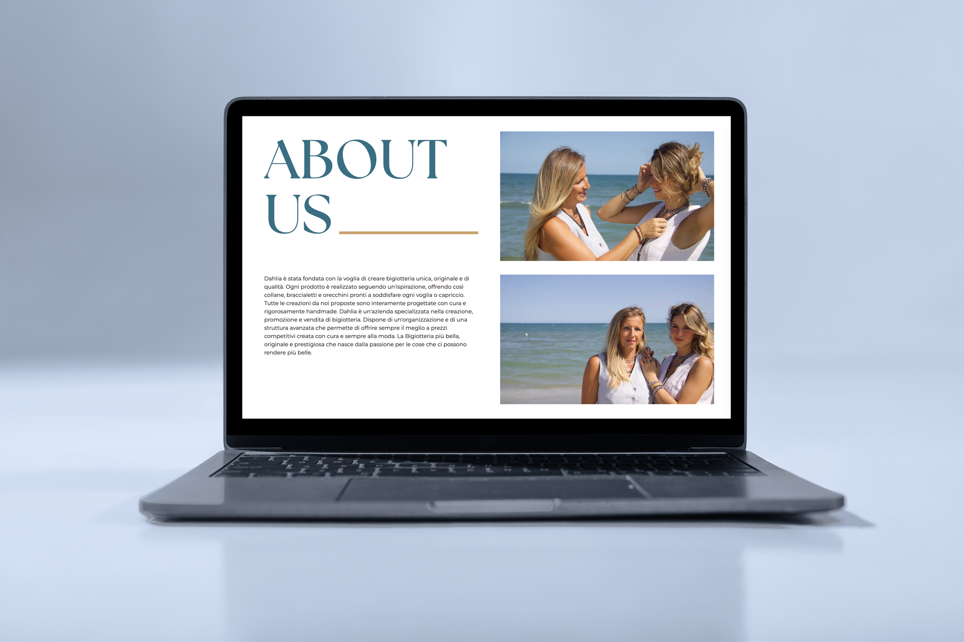
We designed the About Us page with a split text-and-image layout. The typographic section plays on a chromatic contrast between the brand's teal and black, with a gold decorative accent echoing the jewellery aesthetic. Editorial photos of the founders complete the page, conveying authenticity and brand identity.