Chips Fruit
The fruit you loved, now crunchy.
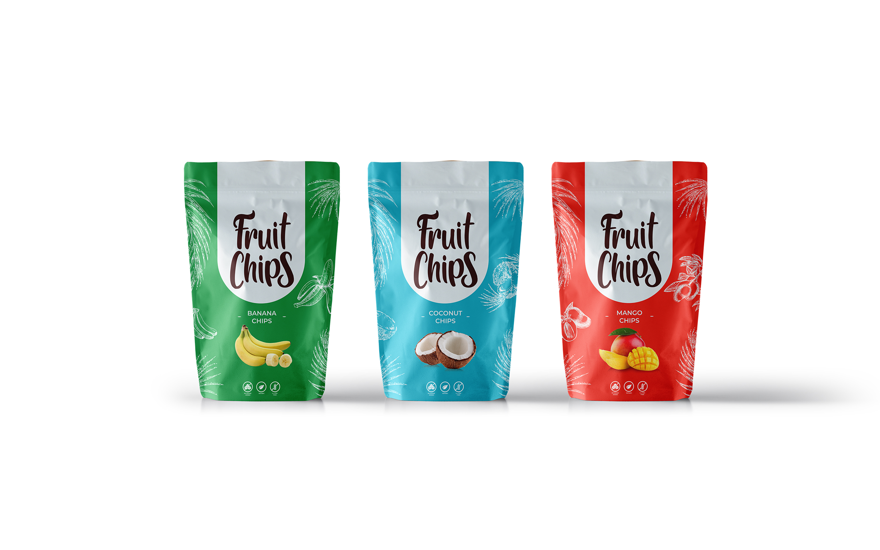
We designed the entire product line identity for 'Chips Fruit'. This complete layout showcases the various pouch formats (mango, coconut, apple) and their respective fruity icons. The design plays on vibrant colors and playful typography to position the product as a healthy and fun snack for the whole family.
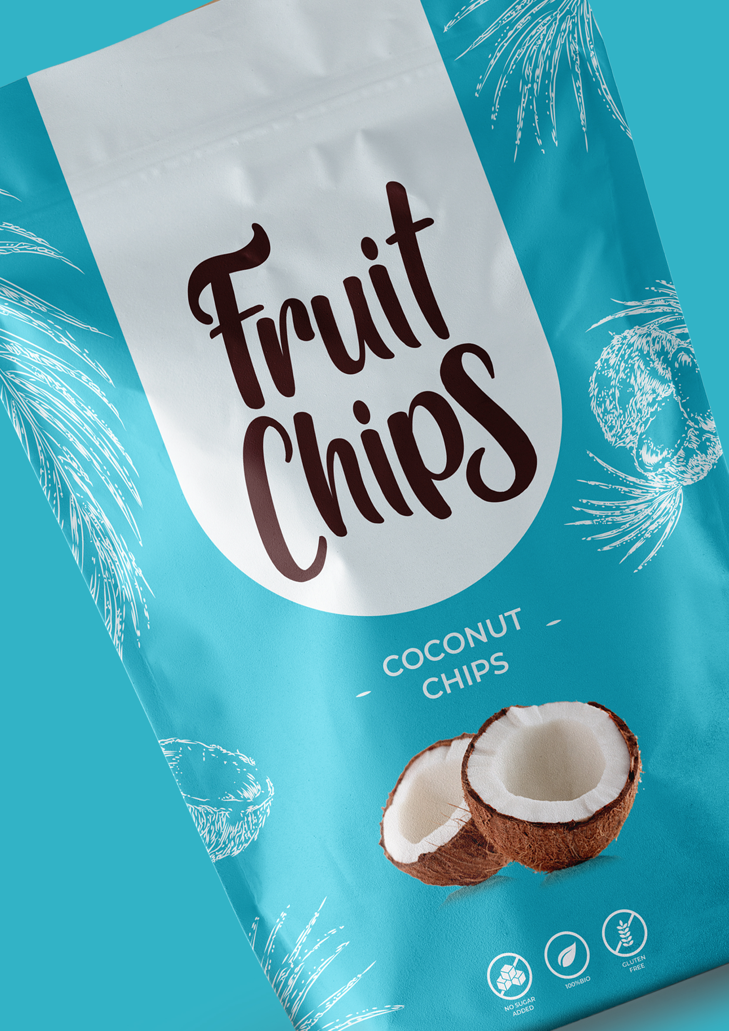
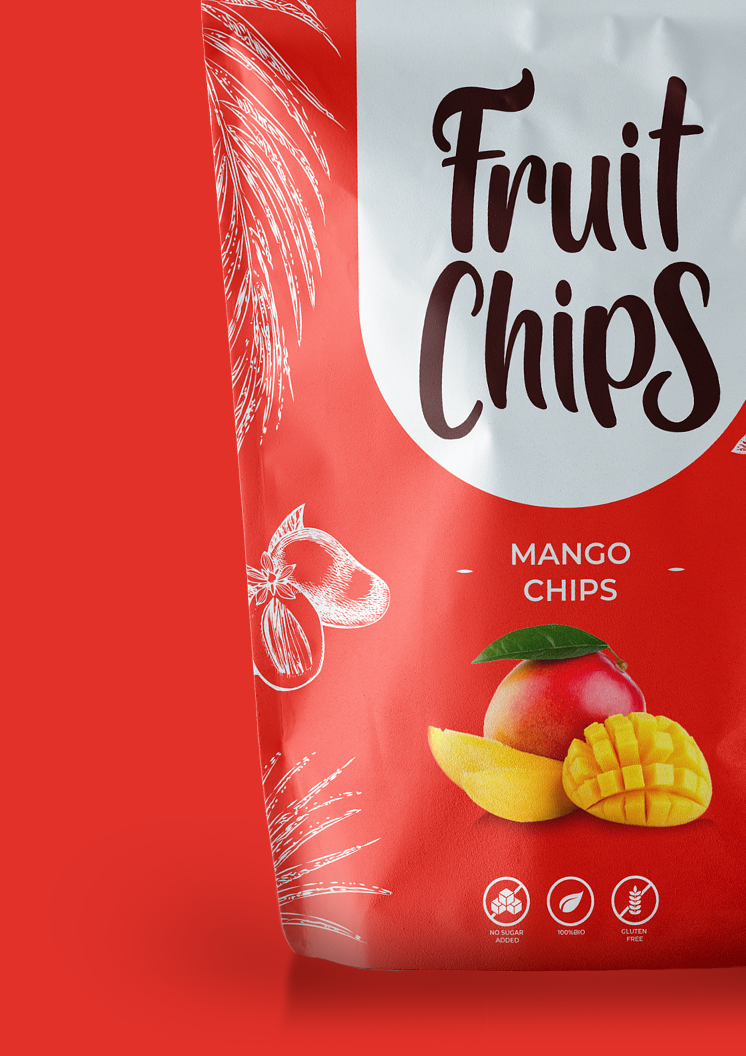
A macro detail centered on the coconut pouch. We worked on the realistic rendering of the fruit icon and the cleanliness of the main logo. The cool, clean color palette of the coconut contrasts with the warm palette of the mango, creating an immediate chromatic distinction for the product line.
A macro detail centered on the coconut pouch. We worked on the realistic rendering of the fruit icon and the cleanliness of the main logo. The cool, clean color palette of the coconut contrasts with the warm palette of the mango, creating an immediate chromatic distinction for the product line.